Creating a mobile-friendly website has never been easier! You don’t need to be a coding expert or hire someone to build a functional and attractive website that works well on all mobile platforms and devices. Whether you’re running a business or just sharing your passions, having a mobile-friendly website is crucial to providing the best experience for your visitors, especially those using mobile devices.
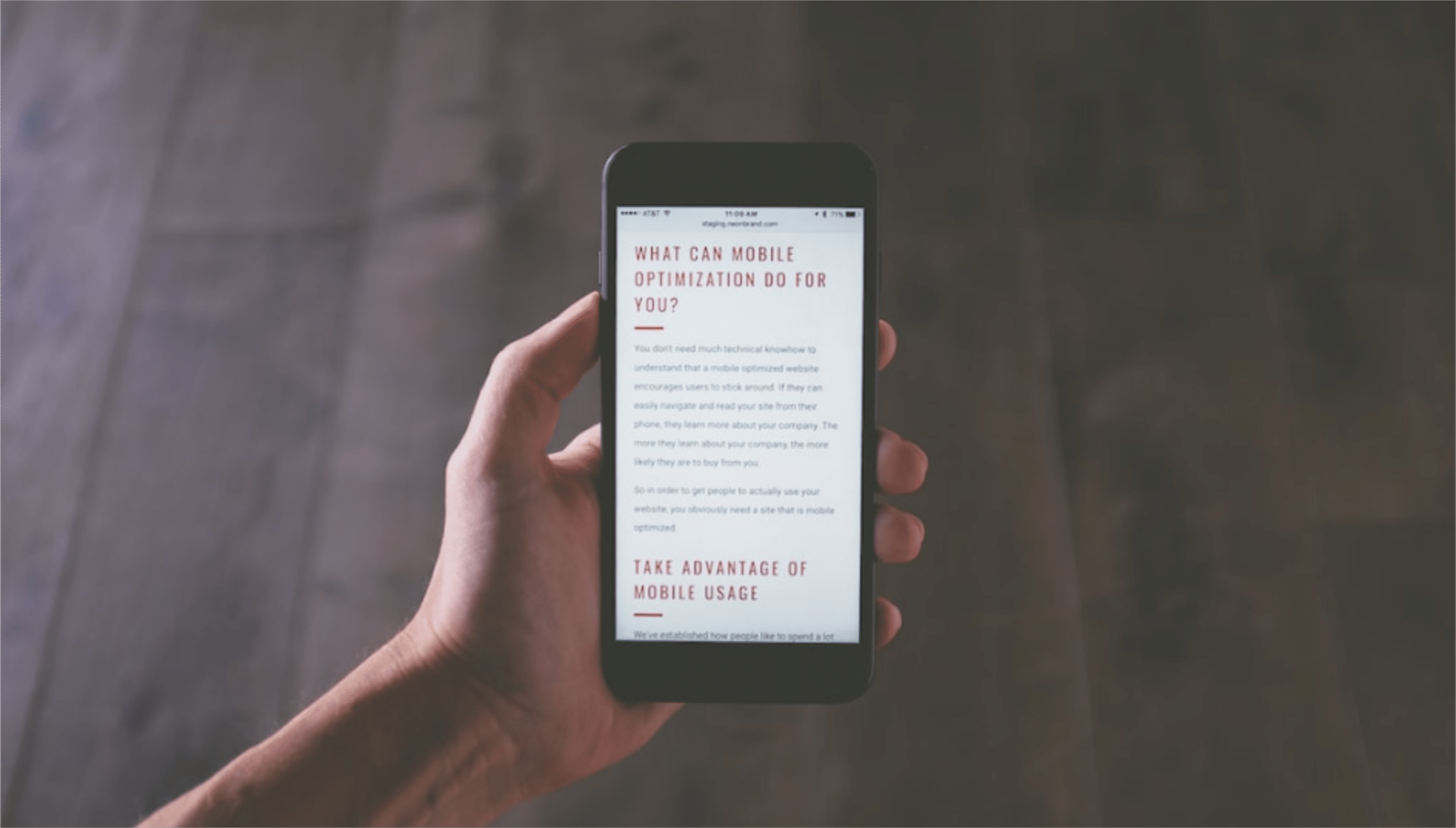
Did you know that more than half of all website traffic comes from mobile devices? That’s right! People love browsing the internet on their mobile phones and tablets. Search engines like Google have noticed this trend and now give preference to websites that are mobile-friendly. This means that if you want your website to rank well on Google and attract more visitors, you must ensure it’s a mobile optimized website.
The rise of smartphones has made mobile browsing more popular than ever. Almost everyone has a powerful all-in-one device in their pocket that they use for almost everything! That’s why it’s crucial to make sure your website looks great and works smoothly on smaller screens.
A mobile-friendly website is not only beneficial for your search engine ranking, but it also provides a better mobile experience for your users. When your website is mobile-friendly, it automatically adjusts its layout to fit different screen sizes, making it easier for people to navigate and read your content.
Google has been placing more emphasis on mobile search. In fact, around 70% of the web is now indexed based on mobile versions of websites. So, if your website isn’t mobile-friendly, it might not show up as high in search results.
In this article, we’ll share some helpful tips on how to make your website mobile-friendly, so both your users and Google will love it! Let’s get started and make your website shine on mobile devices!
What Does Responsive Web Design Mean?
Responsive web design is a web design approach that makes websites look good and work well on all devices, including desktop computers, laptops, tablets, and smartphones. This is done by using flexible layouts and CSS media queries to automatically adjust the website’s appearance based on the size of the screen it is being viewed on.
For example, a website that is designed responsively will automatically change its layout from a two-column layout on a desktop computer to a single-column layout on a smartphone. This ensures that users have a good experience no matter what device they are using to access the website.
There are many benefits to using responsive web design. First, it makes your website more accessible to a wider range of users. In today’s world, more and more people are using mobile devices to access the internet. Responsive web design ensures that these users can still have a good mobile experience on your website.
Second, responsive web design can help to improve your website’s search engine ranking. Google and other search engines now take mobile-friendliness into account when ranking websites in their search results. This means that if your website is responsive, it will be more likely to appear higher in search results on mobile devices.
Finally, responsive web design can save you money. You no longer need to create separate websites for desktop computers, laptops, tablets, and smartphones. With responsive web design, you can create one website that works on all devices.
If you are looking for a way to make your website more accessible, search engine-friendly, and cost-effective, then responsive web design is the way to go.
Why should you optimise your website for mobile devices?
In today’s world, more and more people are using their mobile devices to access the internet. In fact, according to Statista, in the first quarter of 2023, mobile devices (excluding tablets) generated 58.33 percent of global website traffic. This number is only going to increase in the future.
If you don’t have a mobile-friendly website, you’re missing out on a huge opportunity to reach your target audience. A mobile-friendly website is one that is designed to be used on smartphones and tablets. This means that the text and images should be easy to read, the navigation should be easy to use, and the website should load quickly.
There are many benefits to having a mobile-friendly website. Here are a few:
- You’ll reach more customers. As mentioned above, more and more people are using their mobile devices to access the internet. A mobile-friendly website will allow you to reach these people and give them a good experience.
- You’ll boost your sales. A mobile-friendly website can help you boost your sales by making it easier for people to make purchases on your website.
- You’ll improve your search engine ranking. Google now takes mobile-friendliness into account when ranking websites in its search results. This means that if you have a mobile-friendly website, you’ll be more likely to rank higher in search results, which will lead to more traffic to your website.
If you don’t have a mobile-friendly website, now is the time to get one. It’s an essential part of any successful online business.
How to choose the right mobile-friendly solution for your website?
There are three main mobile-friendly solutions for websites: responsive design, dynamic serving, and separate mobile site. Each solution has its own pros and cons, so it’s important to choose the right one for your website.
- Responsive design is the most popular mobile-friendly solution. It uses a single website that changes its layout to fit the size of the device it’s being viewed on. This is the best solution for most websites because it’s easy to implement and maintain, and it doesn’t create any duplicate content issues.
- Dynamic serving is another mobile-friendly solution. It uses a single website, but it sends different HTML and CSS to different devices depending on their size and capabilities. This solution can be more complex to implement than responsive design, but it can improve loading speed for mobile devices.
- Separate mobile site is the least popular mobile-friendly solution. It creates a separate website for mobile devices. This solution can be useful for websites with a lot of content, but it can be difficult to maintain and it can create duplicate content issues.
So, how do you choose the right mobile-friendly solution for your website? Here are a few things to consider:
- The size of your website. If your website is small and doesn’t have a lot of content, responsive design is probably the best solution. If your website is large and has a lot of content, dynamic serving or a separate mobile site might be a better option.
- The devices your visitors use. If most of your visitors use smartphones, responsive design is probably the best solution. If you have a lot of visitors who use tablets or laptops, a separate mobile site might be a better option.
- Your budget. Responsive design is the most affordable mobile-friendly solution. Dynamic serving and a separate mobile site can be more expensive to implement and maintain.
Once you’ve considered these factors, you can choose the right mobile-friendly solution for your website. Remember, the best solution for one website might not be the best solution for another website. So, it’s important to choose only the critical functions and solution that’s right for your specific needs.
How to check if your website is mobile-friendly?
Do you want to make sure your website is easy to use on mobile devices? Here are a few ways to check:
- Use Google’s Mobile-Friendly Test: This free tool will tell you in seconds if your website is mobile-friendly. Just enter your website’s URL and Google will give you a score and a list of any problems.
- Check your Google Search Console: If you have a Google Search Console account, you can also check your website’s mobile usability score in the Mobile Usability report. This report will show you any issues that could be affecting your website’s ranking in mobile search results.
- Use a third-party tool: There are a number of third-party tools that can help you check your website’s mobile-friendliness. Some popular options include W3C Mobile Checker and IONOS Website Checker.
How to make a website mobile friendly
If you want your website to be accessible to people who use mobile devices, you need to make it mobile-friendly. Here are a few things you can do to build a mobile-friendly website:
Develop a responsive layout
- Choose a mobile-responsive theme or template. A mobile-responsive theme or template will automatically adjust the layout of your website to fit the size of the device it’s being viewed on. This is the best way to make sure your website looks good and is easy to use on all devices.
- Develop a responsive layout. A responsive layout is a type of web design that allows your website to adapt to the size of the device it’s being viewed on. This means that your website will look good and be easy to use on all devices, from desktops to smartphones.
- Convert or recreate your desktop site for mobile. If you already have a website that’s not mobile-friendly, you can convert or recreate it for mobile. There are two ways to do this:
- Use a website builder. Website builders make it easy to create a mobile-friendly website without any coding knowledge. They offer a variety of templates and features that can help you create a website that looks good and is easy to use on mobile devices.
- Use a CMS plugin. If you have a WordPress website, you can use a CMS plugin to make it mobile-friendly. There are a number of plugins available that can help you with this, such as WPtouch Pro and MobilePress.
- Optimize your images. Large images can slow down your website’s loading time, which can be frustrating for mobile users. Optimize your images by reducing their file size without sacrificing quality.
- Test your website on mobile devices. Once you’ve made your website mobile-friendly, it’s important to test it on a variety of mobile devices to make sure it looks good and works properly. This will help you catch any problems before your mobile users do.
By using mobile optimization and following these tips, you can build a mobile-friendly website that is accessible to people who use all types of devices. This will help you reach a wider audience and improve your website’s ranking in search results.
Make Information People Look for Easier to Find
When people use their mobile devices to visit your website, they are usually looking for something specific. They want to find the information they need as quickly and easily as possible. To make sure your mobile visitors have a good experience, you need to make sure the information they are looking for is easy to find.
Here are a few tips for making information people look for easier to find on your website:
- Put the most important information front and center. When people visit your website on their mobile devices, they don’t have a lot of time to look around. Make sure the most important information is easy to find, such as your contact information, your hours of operation, and your menu.
- Use clear and concise language. When you are writing for mobile devices, it is important to use clear and concise language. People are more likely to read and understand information that is easy to read.
- Use images and videos. Images and videos can be a great way to break up text and make your website more visually appealing. They can also help to explain complex concepts in a way that is easy to understand.
- Use a search bar. If you have a lot of content on your website, it is a good idea to add a search bar. This will allow people to find the information they are looking for quickly and easily.
- Test your website on mobile devices. Before you launch your website, make sure you test it on a variety of mobile devices. This will help you to make sure that the information is easy to find and that the website is easy to use.
By following these tips, you can make sure that the information people look for on your website is easy to find. This will improve the overall experience for your mobile visitors and help you to increase conversions.
Optimise the Site’s Speed
Mobile users are more likely to leave your website if it takes too long to load. That’s why it’s important to optimise your website’s speed for mobile devices.
Here are a few tips:
- Use a fast and reliable web hosting provider. This will help ensure that your website loads quickly for all users, but it’s especially important for mobile users.
- Reduce the number of images and videos on your homepage. Images and videos can take a long time to load, so it’s best to keep them to a minimum on your homepage.
- Use lazy loading for images. Lazy loading means that images only load when they’re visible on the screen. This can help improve your website’s speed, especially for mobile users with slow internet connections.
- Compress your images. Compressing your images will reduce their file size without sacrificing quality. This can also help improve your website’s speed.
- Use a content delivery network (CDN). A CDN is a network of servers that deliver your website’s content from the server that’s closest to the user. This can help improve your website’s speed for users all over the world.
- Avoid pop-ups. Pop-ups can be annoying, especially on mobile devices. If you must use pop-ups, make sure they’re small and non-intrusive.
By following these tips, you can improve your website’s speed for mobile devices and give your users a better experience on mobile sites.
Change button size and placement
Buttons are an important part of any website, but they can be especially important on mobile devices. That’s because people use their thumbs to navigate on mobile devices, and it can be difficult to hit small buttons with your thumb.
Here are a few tips for changing button size and placement on mobile devices:
- Make buttons big enough to hit with your thumb. This is especially important for buttons that are important, like call to action buttons.
- Place buttons where they’re easy to reach with your thumb. The best place for buttons is usually at the bottom of the screen, on the side opposite your thumb.
- Avoid putting too many buttons close together. This can make it difficult to hit the button you want.
- Use different colors or shapes for buttons to make them stand out. This will help people see the buttons and hit them more easily.
- Test your buttons on different mobile devices to make sure they’re easy to use. This is the best way to make sure your buttons are working well for your users.
By following these tips, you can make sure your buttons are easy to use on mobile devices. This will improve the user experience for your mobile visitors and help you get more conversions.
Use a Large and Legible Font on Mobile Devices
When it comes to designing a website for mobile devices, one of the most important things to keep in mind is font size. The smaller the screen, the harder it is to read small text.
Here are a few tips for using a large and readable font on mobile devices:
- Use a font size of at least 16px. This is the minimum font size that most people will be able to read comfortably on a mobile device.
- Choose a simple, sans-serif font. Serif fonts can be more difficult to read on small screens, so it’s best to stick with a simple sans-serif font.
- Use plenty of white space. White space can help to make text easier to read on a small screen.
- Avoid using too many different fonts on the same page. This can make the text look cluttered and difficult to read.
- Test your font size and style on different mobile devices. Make sure that your text is readable on a variety of devices, from smartphones to tablets.
By following these tips, you can make sure that your website is easy to read on mobile devices. This will improve the user experience for your mobile visitors and help you get more conversions.
Space Out Links on Mobile Devices
When designing a website for mobile devices, it’s important to space out your links so that they’re easy to click. This is because mobile screens are smaller, so it’s harder to accurately tap on a link with your finger.
Here are a few tips for spacing out links on mobile devices:
- Use a generous amount of space between links. This will give users enough room to tap on the link they want without accidentally tapping on the wrong one.
- Use different colors or styles for your links. This will help users to visually distinguish between links and other text on the web page.
- Group related links together. This will make it easier for users to find the links they’re looking for.
- Limit the number of links on a web page. Too many links can be overwhelming and make it difficult for users to focus on what’s important.
- Make sure your links work! Test your links on different mobile devices to make sure they’re working properly.
By following these tips, you can make sure that your links are easy to click on mobile devices. This will improve the user experience for your mobile visitors and help them to find the information they’re looking for.
Optimize Forms on Mobile Devices
Forms are a great way to collect information from your visitors, but they can be difficult to fill out on a mobile device. Here are a few tips to make sure your forms are mobile-friendly:
- Keep the number of fields to a minimum. The fewer fields you have, the easier it will be for users to fill out your form.
- Use large, clear labels. Labels should be easy to read and understand, even on a small mobile screen.
- Use placeholder text. Placeholder text is text that appears in a form field when it’s empty. This can help users know what kind of information they need to enter.
- Make the submit button big and easy to tap. The submit button is the most important button on your form, so make sure it’s easy to find and tap.
- Use inline validation. Inline validation means that error messages are displayed next to the field where the error occurred. This helps users quickly identify and fix errors.
- Avoid drop-down menus. Drop-down menus can be difficult to use on mobile devices. Instead, use radio buttons or checkboxes.
- Use auto-fill. Auto-fill can help users fill out your form more quickly. Make sure your form is compatible with the auto-fill features of the user’s device.
How to Choose a Mobile Web Designer
If you want your website to look good and be easy to use on mobile devices, you need to hire a good mobile web designer. Here are some things to look for when choosing a mobile web designer:
- Experience: Make sure the designer has experience designing mobile websites. You can look at their portfolio to see examples of their previous work.
- Responsive design: A responsive website means that it will look good on any screen size, from a desktop computer to a smartphone. Make sure the designer knows how to create responsive websites.
- Mobile-first: A mobile-first approach means that the designer will start by designing the mobile version of your website, and then they will create the desktop version. This is important because most people now use their mobile devices to access the internet.
- User experience: A good mobile web designer will focus on creating a website that is easy to use and navigate. They will make sure that the text is easy to read, the images are clear, and the buttons are easy to click.
- SEO: A mobile web designer should also know about SEO, or search engine optimization. This means that they will make sure your website is optimized for search engines so that people can find it when they search for your products or services.
- Communication: It is important to be able to communicate well with your mobile web designer. Make sure they are willing to listen to your ideas and that they are responsive to your questions.
- Price: Website design services can be expensive, so it is important to get quotes from different designers before you make a decision. However, it is also important to remember that you get what you pay for. A good mobile web designer will charge more, but they will also create a website that is worth the investment.
Once you have found a few mobile web designers that you are interested in, you should interview them to see if they are a good fit for your project. Ask them about their experience, their process, and their rates. You should also get a sense of their personality and whether you feel comfortable working with them.
Choosing a mobile web designer is an important decision, but it doesn’t have to be difficult. By following these tips, you can find a designer who will create a website that looks great and works well on mobile devices.
How much does a mobile website cost?
The cost of a mobile website can vary depending on a number of factors, including the size and complexity of the website, the features that are included, and the level of customization. However, most basic mobile websites can be created for around £700.
Here are some of the factors that can affect the cost of a mobile website:
- Size and complexity: The larger and more complex the website, the more it will cost to create. This is because it will take longer to develop and will require more design and development work.
- Features: The features that are included in the website can also affect the cost. For example, a website with an online store will be more expensive than a website with a simple contact form.
- Customization: The level of customization that is required can also affect the cost. A website that is heavily customized will be more expensive than a website that is created using a pre-made template.
If you are on a tight budget, there are a number of ways to save money on a mobile website. For example, you can use a pre-made template or choose a basic website builder. You can also reduce the number of features that are included in the website.
It is important to remember that a mobile website is an important investment for businesses of all sizes. A mobile-friendly website can help you to reach a wider audience and improve your conversion rates. If you are considering creating a mobile website, it is important to get quotes from a few different companies to get the best possible price.
Need to build a mobile website?
Do you want to reach more customers on the go? If so, you need a mobile-friendly website! A mobile-friendly website is one that looks good and works well on smartphones and tablets.
There are a few things you need to do to make sure your website is mobile-friendly:
- Use a responsive design. A responsive design means that your website will automatically adjust its layout to fit any mobile screen size. This will make sure that your website looks good and is easy to use on all devices.
- Use clear and concise text. People on mobile devices have shorter attention spans, so make sure your text is easy to read and understand.
- Use large buttons and images. People on mobile devices often have to use their fingers to tap on things, so make sure your buttons and images are big enough to be easily clicked.
- Optimize your images for speed. Large images can slow down your website, so make sure you optimize them for mobile devices.
- Test your website on different devices. Once you’ve built your mobile website, make sure you test it on a variety of devices to make sure it looks and works properly.
If you’re not sure how to make your website mobile-friendly, you can use a website builder or hire our web and mobile design team who have over a decade in building mobile friendly websites .
Building a mobile-friendly website is a great way to reach more customers and grow your business. So what are you waiting for? Get started today with our mobile website design services!
