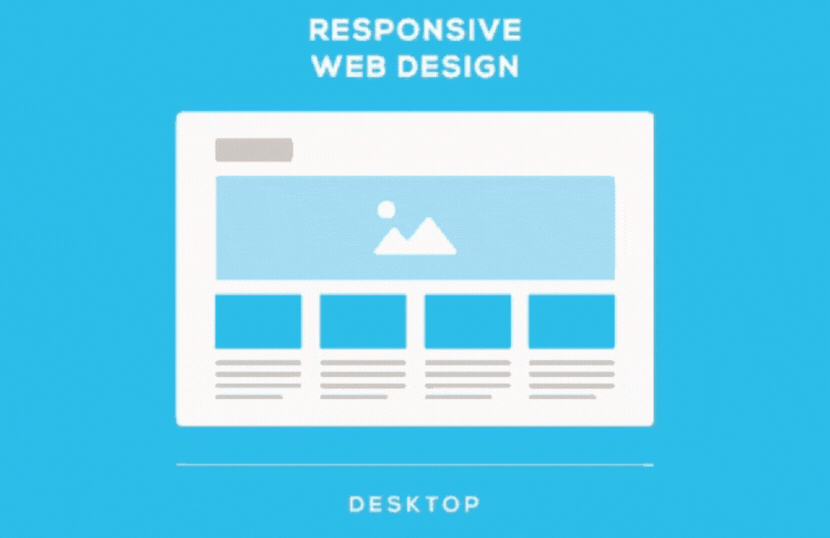
Responsive web design is an approach that enables a website to display optimally on various devices, including cell phones, tablets, laptops, and desktop screens. By implementing responsive web design, businesses can enhance user experience, improving conversions and business growth.
In this guide, you will discover everything you need to know about responsive website design, such as definitions, step-by-step instructions, and real-life examples.
What is Responsive Design?
Responsive design is a web design approach that makes your website or web page look and perform well on all devices, from laptops and desktops to smartphones and tablets.Responsive design is achieved through media queries, which allow you to specify different layouts for your website or web page depending on the device width, screen viewport width, or device orientation.
There are many benefits to using responsive design, including the following:
- Increased accessibility: Responsive design makes your website or web page accessible to a broader range of users, as it can be viewed and used on all devices.
- Improved user experience: Responsive design provides a better user experience on all devices. The layout and content are automatically adjusted to fit the screen size.
- Improved search engine ranking: Responsive design is considered a best practice by search engines, and responsive websites are often ranked higher in search results.
- Improved brand consistency: Responsive design helps to maintain a consistent brand identity across all devices, as the same design elements are used on all devices.
Responsive design is an excellent option to improve your website or web page.
Why Responsive Design is so Popular
In the early 2010s, the way people browsed the web changed drastically. More and more people started using mobile devices like smartphones and tablets to access the internet, and this trend of mobile phone browsing has only continued to grow.
This posed a problem for web designers and developers. They had to create websites that could be viewed and used on various devices, mostly smaller screens with different screen sizes and resolutions.
There were two main approaches to this problem:
- Create multiple versions of the website, each optimized for a specific device. This was a time-consuming and expensive option.
- Use responsive design to create a single website that would automatically adjust to the screen size of the device on which it was being viewed.This was a more efficient and cost-effective option.
Responsive design quickly became the preferred approach for web designers and developers everywhere. It was the best way to ensure that their websites would be accessible to everyone, regardless of their device.

Why Responsive Design Matters
Responsive design is vital for several reasons:
- It ensures that your website is accessible to everyone. More and more people are using mobile devices to access the internet, and responsive design makes it easy for them to have a mobile version of the website they are viewing on their devices.
- It improves the user experience.When a website is not responsive, it can be challenging to use on mobile devices. Buttons and links can be too small to tap on, and images can be stretched and distorted. Responsive design makes it easy for users to view and interact with your website on their devices.
- It improves your search engine ranking. Search engines favor responsive websites. When your website is responsive, it is more likely to rank higher in search results.
- It makes your website look professional. A responsive website looks good on all devices, regardless of the screen size. This makes your website more appealing to visitors and helps you build trust.
Using responsive design, you can take advantage of several significant benefits. Responsive design is essential for creating a website accessible to everyone, has a good user experience, and ranks well in search results.
How does responsive web design work?
Responsive web design uses media queries to adjust the layout of web pages and render a website based on the screen size of the device it is being viewed on. This means a website will look different on a mobile device than on a desktop computer.
There are a few different ways to implement responsive web design. One way is to use a responsive theme or template. Many responsive themes and templates are available, so you should be able to find one that fits your needs.
Another way to implement responsive web design is to use a responsive framework. A few different responsive frameworks are available, such as Bootstrap. These frameworks provide the functionality you need to create a responsive website.
Finally, you can also implement responsive web design by hand. This is the most challenging option, but it gives you the most control over the design column layout of the responsive page on your website.
There are a few benefits to using responsive web design:
- It makes your website more accessible to users on all devices.
- It can improve the user experience on desktop and mobile browsers.
- It can help you improve your search engine ranking.
If you want to improve your website, responsive web design is a great option. It is a relatively easy way to make the layout elements of your website more accessible to users on all devices.
Understanding the Elements of Responsive Web Design
To understand responsive web design, you need to use three main features: a flexible grid, flexible images, fluid layouts, and media queries that show different views in different contexts.
A flexible grid is an essential part of responsive design. This means defining parameters for columns, spacing, and containers to create a layout that can adapt to different screen resolutions and sizes. You can use existing grid systems, but creating a custom solution offers more flexibility and is less time-consuming. It’s essential to have a flexible grid for responsive web design.
Flexible images are pictures that move and scale with a flexible grid. It’s crucial to avoid loading large images and scaling them down, slowing web page load times. Instead, you can crop images with CSS or use multiple versions of an image on the server and dynamically serve the appropriately sized version depending on the screen dimensions, browser width, and user agent using server-side or client-side feature detection.
Media queries are essential to responsive web design. They allow designers to build multiple layouts using the same HTML documents and serve stylesheets based on the user agent’s features. This can be the browser window’s size, orientation, screen resolution, and color. However, more than media queries are needed to create a responsive web design. It would help to have a strong HTML and CSS foundation with a flexible grid and images.
Responsive design best practices
Creating flexible and accessible web pages for mobile users requires responsive design, which can be achieved through following responsive web design guidelines and tips:
- Prioritise mobile design by assuming a mobile-first mentality. This approach means designing for small screens first and gradually enhancing the design for larger ones. Prioritize content, create significant, easy-to-click touch points, and leave complex images and graphs for the desktop version.
- Use Scalable Vector Graphics (SVGs), an XML-based file format for 2D graphics that are resolution independent and look crisp on any screen size.
- Design for at least three different devices with multiple breakpoints that adjust the layout of your web page based on the browser window width to ensure your content is optimized for each device and users have a consistent experience.
- Prioritise important content based on user context by checking your visual hierarchy, using progressive disclosure, and navigation drawers. Nonessential items should be secondary.
- Keep your design simple and minimal to ensure ease of navigation and understanding.
- Use design patterns to improve ease of use and quicken users’ familiarity. For example, the column drop pattern fits content to many screen types, enhancing the user experience.
- Ensure readability using legible font size and style and adequate contrast and background color. Consider using typographic scales to harmonize body copy and headlines. Avoid text within images, which may pose challenges to screen readers.
- Watch out for potential issues, such as elements shifting independently if media queries are not set up correctly and advertisement formats causing problems, especially on mobile devices.
Responsive design is an excellent approach to enhancing user experience, ensuring uniformity, seamlessness, and simplicity in your design efforts. It is SEO-friendly, and multiple CMS and frameworks, such as WordPress and Bootstrap, make it affordable to implement. Following these best practices, you can create responsive designs that provide an optimal user experience across different devices.

Advantages and disadvantages of responsive design
Responsive web design offers both advantages and disadvantages to consider when making decisions. Some benefits of responsive design are:
- User-friendly experience: Responsive design adjusts to user behavior and needs, such as screen size, resulting in a website that functions well on any device. This expands the website’s audience to customers and users on mobile devices like smartphones and tablets.
- SEO-friendly: Responsive websites rank higher on search engines like Google because they load quickly on mobile devices, enhancing user experience and increasing the website’s ranking.
- Increased profits and sales: Responsive design saves time, effort, and maintenance costs by producing a website that fits all screen sizes, eliminating the need for a separate mobile site. This leads to a better user experience and a broader audience, which can result in more profits and sales.
- Low maintenance: Responsive design eliminates the need for a separate mobile site, saving time and costs associated with testing and support. Managing a single website requires less maintenance, saving time and money.
- Easy user tracking: Responsive design simplifies tracking site visitors, saving time and effort.
However, there are also some disadvantages to responsive web design to be aware of:
- Slow page loading: Responsive websites may take longer due to high-resolution images and videos.
- Difficult navigation: Simplifying large websites for small devices can make navigation more difficult due to the limited screen size.
- Time-consuming development: Developing a responsive website takes longer than developing a standard one.
Frequently asked questions
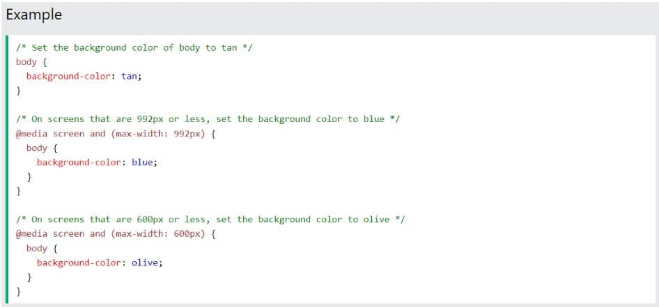
What is a Media Query
Media queries are essential for responsive web designs. They allow you to create layouts based on viewport size and detect environmental factors like touchscreen usage. By leveraging media queries, you can optimize your website for different screens, orientations, and resolutions. No more horizontal scrolling or distorted images! Embrace media queries to build user-friendly and adaptable websites. Experience the true potential of responsive design today.
What is Adaptive Web Design
Adaptive Web Design is about creating different website layouts for each device’s screen. When the site loads, it detects the screen size and displays the appropriate layout. This design approach adapts to various screen sizes, offering a tailored user experience. It involves multiple fixed layouts that align with the user’s device, such as phones, tablets, or computers. The benefits are significant: faster page loading, efficient performance, customized user experience, ability to expand your existing website without starting over, reaching a wider audience, and maintaining a single website URL. Adaptive Web Design ensures seamless browsing across devices and enhances user satisfaction.
What is Search Engine Optimization
Search Engine Optimization (SEO) is a strategy to help your website rank higher on search engine results pages (SERPs) and attract more visitors. The goal is to appear on Google’s first page when people search for relevant terms. Here’s a step-by-step breakdown of how SEO works:
- Find keywords that match your target audience’s search queries.
- Incorporate these keywords in your page title.
- Include keywords in the page URL for better visibility.
- Craft a compelling meta description with relevant keywords.
- Use keywords in the heading (H1) of your content.
- Incorporate keywords naturally throughout your page’s content.
- Build external links pointing to your website for increased credibility.
- Keep track of your ranking to assess the effectiveness of your SEO efforts.
By following these steps, you can enhance your website’s visibility and attract more organic traffic.
Conclusion
Responsive design is essential for any website that wants to reach a wider audience. It is relatively easy to implement and has many benefits, such as improved search engine ranking and a better user experience. However, it is vital to be aware of the drawbacks of responsive site design, such as the increased complexity and time required to develop and maintain a responsive website.
Experience the power of responsive design with our expert services. As one of the leading responsive web design companies, we create visually stunning and user-friendly websites that seamlessly adapt to any device. Stay ahead of the competition with our responsive design solutions.
